Blaylock
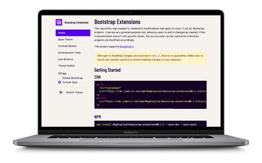
Bootstrap Extensions
As you’ll see from my portfolio, I use Bootstrap in nearly all of my projects. I genuinely believe it’s the best CSS framework available—especially when paired with Sass. While I’ve tried many other frameworks (and I’m sure they work well for other developers), none of them feel as natural to me as Bootstrap.
That said, Bootstrap isn’t perfect.
I often run into recurring issues, particularly around Dark Mode integration. I could solve these problems across multiple projects, but I decided I would rather centralize those solutions.
Bootstrap Extensions is my way of accomplishing this. It’s an NPM package that includes common improvements, enhancements, and utilities I use regularly. Now, instead of copying and pasting the same code, I can drop this package into any new project, tweak as needed, and keep moving.
Features
Each feature is modular—you can import only what you need.
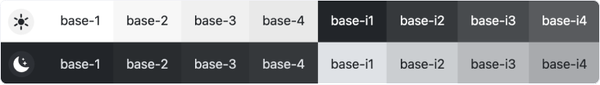
Base Theme
A neutral, scalable theme with 4 light variants and 4 dark variants.
These support text, background, buttons, and other common elements. It’s built to work with both system dark mode and manual toggles, offering much more flexibility than Bootstrap provides out of the box.
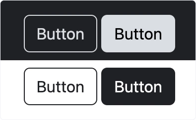
Contrast Button
A minimalist button style, ideal for quick projects or stripped-down UI needs. It’s based on the base theme but with fewer dependencies and more simplicity. I actually wrote a blog article on how to easily integrate this without installing this package.
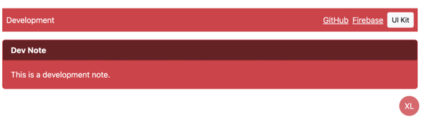
Development Tools
Optional utilities to aid development, including:
- A floating developer toolbar to assist with links to development only sites
- Inline developer notes
- Floating media query size indicator in the bottom corner of the screen
All tools can and should be hidden in production environments.
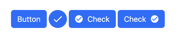
Icon Buttons
Styled buttons that work especially well with icon systems like Material Design Icons. These styles support both icons inside buttons and standalone icon buttons.
This pairs well with a component-based approach to avoid duplicating SVGs.
Theme Switch
A fully styled and accessible theme switch component that supports:
- Light / Dark / System modes
- Smooth toggling
- Integration with Bootstrap’s variable system
Bootstrap ships a dark theme but leaves integration largely up to the user. This switch simplifies the process and provides a better out-of-the-box experience.

Notes
This package was built for my own use across multiple projects, and I actively maintain and refine it. If you’re a Bootstrap user looking for easier theming, better dark mode support, or helpful extensions, this may be a good fit.