Blaylock
Jeffrey R. Wangsgard & Associates
Jeff Wangsgard is a Certified Public Accountant in Cache Valley, and was working with a partner for a number of years before deciding to split the business. Jeff started looking for branding and a website for his new business. He had a one month timeline between when he contacted me to when he would be in his new office space. It was time to get started.
The first thing to start on was branding. I did some brand research and tried out a few options, and ended up with a wordmark. The font I chose was Alegreya Sans SC. It is professional, clean, and not a common font. I especially liked it because it was designed to be a small cap font. Another thing that I liked about the font was that the “J” in Jeffrey goes below the font baseline. I thought that worked really well being the first character in the wordmark.

I played around with a few colors, and chose to go with teal color scheme. To add some contrast, I also added in a golden orange color, which also helps tie in his previous business branding. Once we had his branding in order I gathered all of his branding assets into one package that he could keep at his business, and use however he needed. Some important parts of his package included his logo in different colors and formats, the fonts we used, and the colors listed out in HEX, RGB, and CMYK.

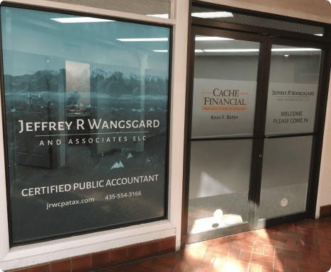
Once Jeff gave me the go-ahead, we moved on to the building signage and promotional materials. Jeff’s business is on Main Street in Logan, and he had a space where he could put his logo on an outdoor sign. He connected me with a sign maker in town that he had worked with before, and got me the dimensions of the sign. Before too long, we had his logo up so everyone could see it. Inside the building, we put up a big window sign on all the exterior windows, and included some instructions to which door was the correct door to use (it was a pretty confusing space if you enter the building through the wrong door). We got some business cards for Jeff and his employees, as well as a tax folder. Jeff was officially ready to start seeing clients.

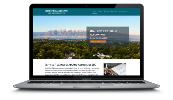
During the same time that we worked on the promotional materials, we also got the website up and running. We took into account the brand throughout the website in every aspect. The technology that I chose to use to build the site was 11ty using Nunjucks for the templating language. Because there was no complex interaction, using a static site generator like 11ty makes perfect sense for this. I also used a Sass-modified version of Bootstrap for the style. Jeff was very quick to get me content for the site, so the site went up very quickly.

It was so much fun to work on this branding and website project with Jeff. I still continue to help him out with any needs he has with branding and website development. It didn’t take long before we started hearing some positive reviews from his clients on how well the brand turned out and how easy the website was to use.