Blaylock
Busy Bee Odd Jobs
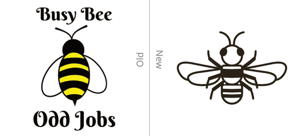
When Wayne approached me about his company I was excited to take on a branding and website project for a budding small business. There were a few good things going for his business. First thing is that Wayne had a unique business name. Because of this, he didn’t have any issues getting a good website domain; busybeeoddjobs.com. Another thing he had going for him is that he started early in his business to get his branding in order, and he had a good vision for what he wanted his brand to be. First, Wayne needed was a logo. He sent over some clip art and put words around it. He had a general idea for what he wanted his brand to be but wasn’t able to execute it himself. I had drawn up a few sketches for a logo and really liked the end result.
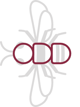
It is always fun to insert something subtle into a logo, similar to the famous FedEx arrow. In this example, if you turn the logo sideways, you can make out the word “ODD” as the main body of the bee. Although it is not the full name of the business, it is part of it and helps tie in the logo to the brand.
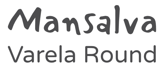
In the initial logo concept that Wayne provided, he had a somewhat rough font. The typography chosen for Busy Bee Odd Jobs is Mansalva, combined with Varela Round. I liked how Mansalva is a rough and somewhat grimy font. Since Busy Bee Odd Jobs will do most any type of labor-intensive jobs, it supports the fact that they are willing to do the messy and tough jobs.
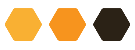
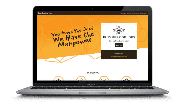
Colors were pretty simple to choose for this project. Having a bee for a logo, I played around mostly with yellow and black color schemes. I ended up with a honey gradient and a dark brown color which turned out fantastic. When you incorporate those colors with a honeycomb-hexagon pattern, you get a solid, recognizable brand.
The website was a lot of fun to put together. Wayne didn’t need much on a website, just enough to show what he can do and get people to contact him. We decided to keep it at just a single page. Wayne and I brainstormed a good hero statement “You have the jobs. We have the manpower.” We added a call to action, which is to hire Wayne, and continued by sharing what services he offered. We decided to have a little fun with showing some projects that Wayne took on, and used a “before and after” slider, so the users can get an interactive experience. Of course, we needed a testimonial and a contact form. To add a cherry on top of the website, we added some animation to help improve the customer’s interest.
I had used 11ty for some other projects and really liked it for a simple static site that has very little interactivity. I used a Sass-modified version of Bootstrap to build out the style of the site. Because it is a simple site it makes it extremely easy to maintain.
It was a pleasure to work with Wayne and take on this Busy Bee Odd Jobs branding and web development. I was even more pleased to hear that the website has helped his business bring in more clients.